
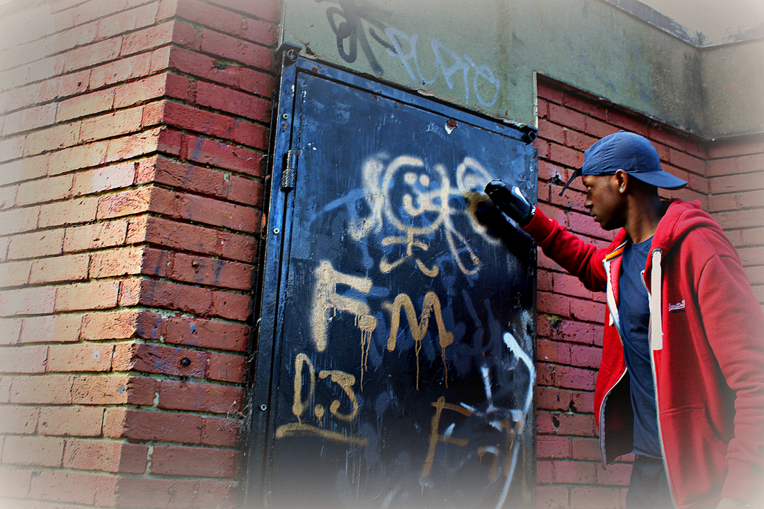
GRAYSON PERRY
I have taken a series of images of objects that I have a strong connection with my sister who is a make-up artist, passionate speaker, and a loving and caring person. I arranged the possessions that belong to her for the final image, ensuring that they are not in a consecutive order due to her being a messy and 'all over the place'. The objects that I have picked out have vibrant colours that are needed to represent her personality traits, like the bright colours show her positive vibes. Through the subjects I have chosen, the interpretations created could be that the certain individual cares a lot about their outside appearance because of the picture frame and how they are being presented. The overall image consists of many small pretty things such as the lipsticks, sunglasses and glamorised jewellery that present beauty in different ways.
I have taken a series of images of objects that I have a strong connection with my sister who is a make-up artist, passionate speaker, and a loving and caring person. I arranged the possessions that belong to her for the final image, ensuring that they are not in a consecutive order due to her being a messy and 'all over the place'. The objects that I have picked out have vibrant colours that are needed to represent her personality traits, like the bright colours show her positive vibes. Through the subjects I have chosen, the interpretations created could be that the certain individual cares a lot about their outside appearance because of the picture frame and how they are being presented. The overall image consists of many small pretty things such as the lipsticks, sunglasses and glamorised jewellery that present beauty in different ways.

MIAZ BROTHERS
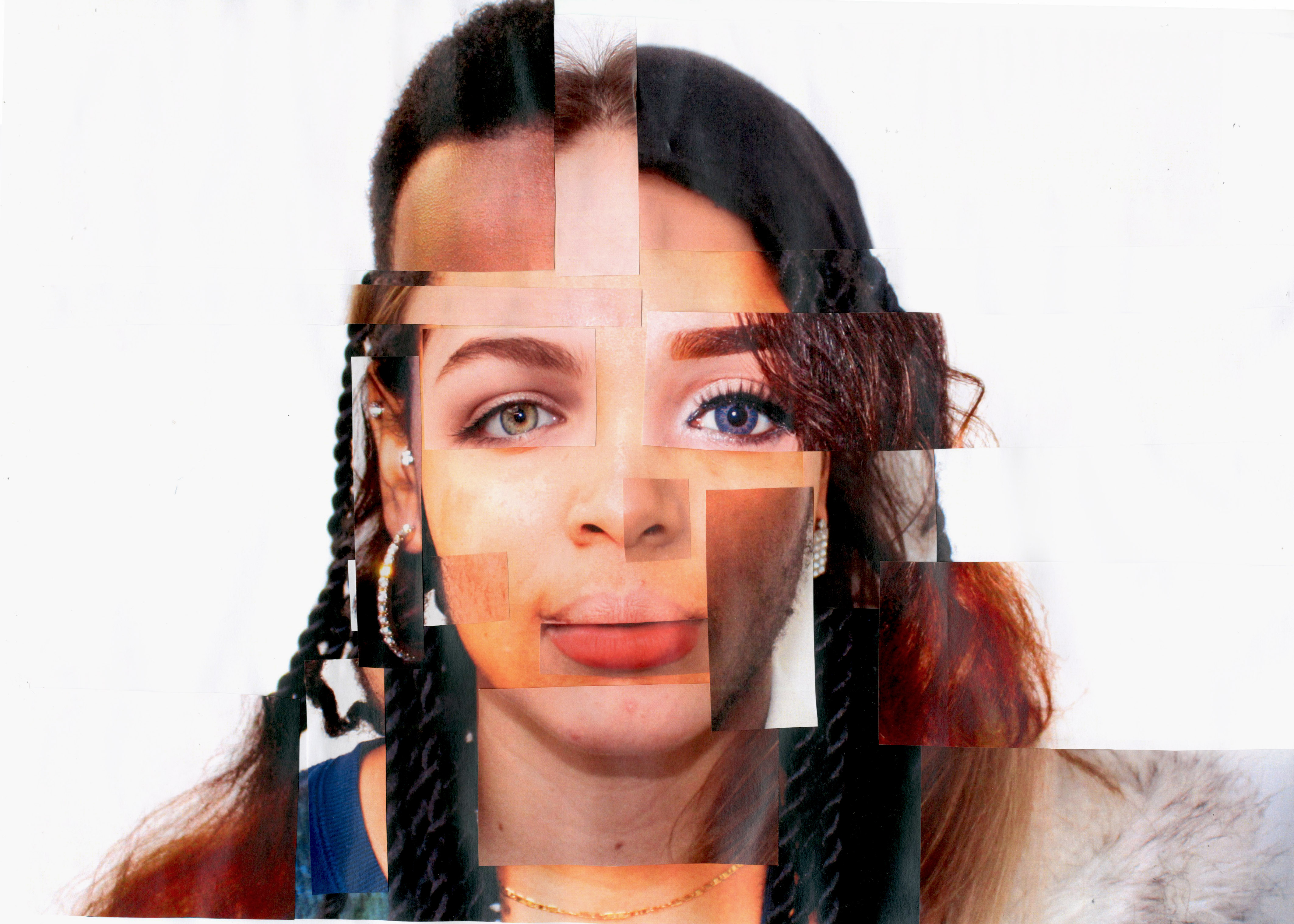
Using the same concept of the Miaz Brothers on how, without those specific lines and curves that are used to shape us individually and form our identity make us all the same. Their idea pinpoints that with our own special features such as how our eyes, nose, lips etc. are shaped we become shapeless and a complete blur therefore what ever makes us, us; we should be able to embrace it confidently. This is also shown through how we dress according to our cultural background, whether we have a different ethnicity, religious faith, and society influence as you can see that something as simple as colour can immediately tell you something about that individual. However, from a different perspective it also demonstrates the equality between the images; even when the lines are blurred it crosses out all the barriers that make us different and unique by taking our culture and identity away. It revels to the audience that we are all somehow the same, created the same way and have feelings, emotions, needs etc. Through showing the sharp lines, it gives us all identity and constructs us to who we are. This response was edited by using the blurring tool and creates a significant meaning which makes the outcome effective.
Using the same concept of the Miaz Brothers on how, without those specific lines and curves that are used to shape us individually and form our identity make us all the same. Their idea pinpoints that with our own special features such as how our eyes, nose, lips etc. are shaped we become shapeless and a complete blur therefore what ever makes us, us; we should be able to embrace it confidently. This is also shown through how we dress according to our cultural background, whether we have a different ethnicity, religious faith, and society influence as you can see that something as simple as colour can immediately tell you something about that individual. However, from a different perspective it also demonstrates the equality between the images; even when the lines are blurred it crosses out all the barriers that make us different and unique by taking our culture and identity away. It revels to the audience that we are all somehow the same, created the same way and have feelings, emotions, needs etc. Through showing the sharp lines, it gives us all identity and constructs us to who we are. This response was edited by using the blurring tool and creates a significant meaning which makes the outcome effective.


JOHN CLANG
For these responses, I tried to reinforce diversity and no matter how different we look and share different cultures, we are still humans and at the same time show off the different multiculturalism that we live in today. I did this because when looking at the overall image you can easily notice the different cultures within the picture. For the responses to be successful, when taking the pictures i tried to ask people that looked very different from each other, for example, the hair type/style, colours worn, different eye colours, different shape eyes, lips, nose etc. and had different personalty traits because even that can be reflected through the images. Overall I think that this was a successful piece that portrays a significant meaning that is needed to be shown and shared within our society.
For these responses, I tried to reinforce diversity and no matter how different we look and share different cultures, we are still humans and at the same time show off the different multiculturalism that we live in today. I did this because when looking at the overall image you can easily notice the different cultures within the picture. For the responses to be successful, when taking the pictures i tried to ask people that looked very different from each other, for example, the hair type/style, colours worn, different eye colours, different shape eyes, lips, nose etc. and had different personalty traits because even that can be reflected through the images. Overall I think that this was a successful piece that portrays a significant meaning that is needed to be shown and shared within our society.


MIHAELA IVANOVA
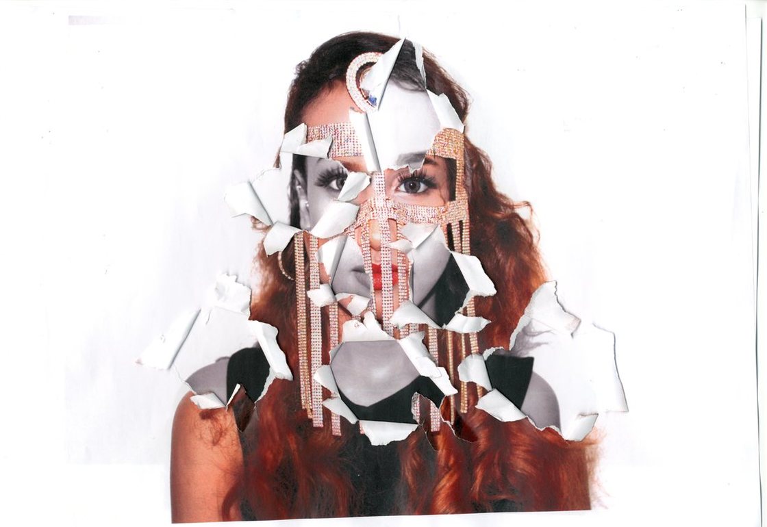
This response is created prior to Mihaela, I have got my model in a very dark location and used a black back drop. The props I used which acts as the subject in the image because it is what catches the audiences attention is the cut out eye piece of paper. It stands out and makes us question the image and what is happening. I tore out an eye image from my other model in black and white and used it as the cover up of the models real eyes. The torn effect on the eyes adds emphasis and makes it feel out of place because the eyes are not hers but, she desires to have it in a forceful way and the is shown through the way she has torn it our roughly/aggressively and through holding it very firmly . The white paper contrasting against the black is what makes the image captivating because the place was dark and I had no strong lighting I used the flash to show what was in front of me and it was worked exceptionally well.
This response is created prior to Mihaela, I have got my model in a very dark location and used a black back drop. The props I used which acts as the subject in the image because it is what catches the audiences attention is the cut out eye piece of paper. It stands out and makes us question the image and what is happening. I tore out an eye image from my other model in black and white and used it as the cover up of the models real eyes. The torn effect on the eyes adds emphasis and makes it feel out of place because the eyes are not hers but, she desires to have it in a forceful way and the is shown through the way she has torn it our roughly/aggressively and through holding it very firmly . The white paper contrasting against the black is what makes the image captivating because the place was dark and I had no strong lighting I used the flash to show what was in front of me and it was worked exceptionally well.

SEBASTIAN ERIKKSON
Through the inspiration of Sebastian Erikkson, I have created the following piece using Photoshop and artistic skills. I used a self-portrait that has a very strong facial expression and gives an insight of seriousness and creates weightiness upon the audience through the direct eye contact. I drew on puzzle pieces onto the image, focusing on the face in particular because that is where the most sensitive part of a human is and can tell us a lot about a person’s centre of emotion. Furthermore, I scanned the image and using the photoshop tolls to uncover the underlying image in black and white. You can still perceive time within the image however I tried to focus on how the girl felt very deeply by secretly trying to uncover the real side to her or how she felt. To achieve this, I used the idea of puzzle pieces and it takes a extensive thought process to understand someone sincerely, not through just a glance. By only revealing some parts of her face in colour and the other in a very dark and dim tone displays that there is more than one emotion happening within the person. Although the image has colour, the colours present are dusky which give off that even the happiness that is aimed to be radiant and glooming to be reflective of happiness has a sense of uncertainty and vagueness. Which means that the person is already on a very low of breaking down although they are trying incredibly hard to be strong, as the facial expression is evident to that.
Through the inspiration of Sebastian Erikkson, I have created the following piece using Photoshop and artistic skills. I used a self-portrait that has a very strong facial expression and gives an insight of seriousness and creates weightiness upon the audience through the direct eye contact. I drew on puzzle pieces onto the image, focusing on the face in particular because that is where the most sensitive part of a human is and can tell us a lot about a person’s centre of emotion. Furthermore, I scanned the image and using the photoshop tolls to uncover the underlying image in black and white. You can still perceive time within the image however I tried to focus on how the girl felt very deeply by secretly trying to uncover the real side to her or how she felt. To achieve this, I used the idea of puzzle pieces and it takes a extensive thought process to understand someone sincerely, not through just a glance. By only revealing some parts of her face in colour and the other in a very dark and dim tone displays that there is more than one emotion happening within the person. Although the image has colour, the colours present are dusky which give off that even the happiness that is aimed to be radiant and glooming to be reflective of happiness has a sense of uncertainty and vagueness. Which means that the person is already on a very low of breaking down although they are trying incredibly hard to be strong, as the facial expression is evident to that.
LORENA COSBA
For my own response I used the same concept of Lorena Cosba, but decided to add more of a cultural element to it and how culture shapes our identity. I’ve taken a portrait of my model wearing a fashionable version of the burka that is considered as jewellery and underneath it is another portrait however, without any cultural elements added. The meaning behind my work is through tearing out some sections of the coloured image and revealing the black and white layer underneath, shows how plain an individual can be when not expressing any form of their cultural identity. To reinforce my idea, I made the cultural image vibrant with colours whereas the bottom image to be lifeless and that has worked in helping the overall image look effective. The white background adds emphasis to the main subject so that it is the main focus. However, for further experiments I will ensure that the images are inline with each other a bit more for the image to look more realistic.
For my own response I used the same concept of Lorena Cosba, but decided to add more of a cultural element to it and how culture shapes our identity. I’ve taken a portrait of my model wearing a fashionable version of the burka that is considered as jewellery and underneath it is another portrait however, without any cultural elements added. The meaning behind my work is through tearing out some sections of the coloured image and revealing the black and white layer underneath, shows how plain an individual can be when not expressing any form of their cultural identity. To reinforce my idea, I made the cultural image vibrant with colours whereas the bottom image to be lifeless and that has worked in helping the overall image look effective. The white background adds emphasis to the main subject so that it is the main focus. However, for further experiments I will ensure that the images are inline with each other a bit more for the image to look more realistic.
|

|
TOM JOHNSON
These images challenge the typical stereotypes that are present within our society today. The main one being, elder people are lifeless, boring, and uncultivated. Therefore, through photography i tried to challenge the stereotypes and show people that the following stereotype is false. Catching elder people in their 'happy moment' when they're having fun or even simply asking them to pose for a picture, here are the responses that I have received. The images may be shocking to many people because they portray the elder generation as happy, joyful and energetic. They also show that they are fun to be around and can be childish at times. The vibrant colours on the image reflect this very effectively. How people actually perceive old people to be? To show this I used those images and then photographed the image as I crunched it even more at each stage. You can now see the dynamic development of how the old become old and wrinkly. How the start to become lifeless and the big smile on their face begins ta fade slowly to the point where even their identity has become in disguise.
These images challenge the typical stereotypes that are present within our society today. The main one being, elder people are lifeless, boring, and uncultivated. Therefore, through photography i tried to challenge the stereotypes and show people that the following stereotype is false. Catching elder people in their 'happy moment' when they're having fun or even simply asking them to pose for a picture, here are the responses that I have received. The images may be shocking to many people because they portray the elder generation as happy, joyful and energetic. They also show that they are fun to be around and can be childish at times. The vibrant colours on the image reflect this very effectively. How people actually perceive old people to be? To show this I used those images and then photographed the image as I crunched it even more at each stage. You can now see the dynamic development of how the old become old and wrinkly. How the start to become lifeless and the big smile on their face begins ta fade slowly to the point where even their identity has become in disguise.


BEHIND THE FRAME
My aim for this photo-shoot was for it to be focused and sharp for the message to come across very effectively and in order to do this, I used a white backdrop for the outcome to be simple and00 not busy with different colours, as the main subject is the model. I got my model to feel openly upset about something that may be s00ensitive and by using emotional music in the background; it has helped me to bring out the emotional side of my model. However, before getting her to feel touching and saddened I used an empty picture frame that she holds against her face as it to show that it is a picture of how she wants to be preserved. Within that picture she is shown to be extremely happy, not showing any side of how she really felt or who she really was. However, to bring my message across, I used her real self-image that was hidden to the world to be the one behind the picture frame. This demonstrates how in order to reach the standard society has set, we may not be able to confidently express our identity or culture and this has led to us feeling upset and destroyed.
My aim for this photo-shoot was for it to be focused and sharp for the message to come across very effectively and in order to do this, I used a white backdrop for the outcome to be simple and00 not busy with different colours, as the main subject is the model. I got my model to feel openly upset about something that may be s00ensitive and by using emotional music in the background; it has helped me to bring out the emotional side of my model. However, before getting her to feel touching and saddened I used an empty picture frame that she holds against her face as it to show that it is a picture of how she wants to be preserved. Within that picture she is shown to be extremely happy, not showing any side of how she really felt or who she really was. However, to bring my message across, I used her real self-image that was hidden to the world to be the one behind the picture frame. This demonstrates how in order to reach the standard society has set, we may not be able to confidently express our identity or culture and this has led to us feeling upset and destroyed.


YOUTH CULTURE
The roughness of the location adds to the emphasis of the characteristics that are trying to be reflected of the individual, also I have ensured that the details of them image such as colour is well-thought because it is significant when trying to read a persons thoughts, feeling and emotion. It gives us a clear insight of how the person is built visually and mentally. The bloodshot red against the dark foreground colour demonstrate danger, adventure, excitement of the teenager. I wanted to dramatically alter my photo composition by just changing my perspective which will be seen from the audiences perspective too. I wanted them to see it from a perspective where the model is not aware a picture is being taken so that we can see them secretly at their adventure or doing something that is a norm to them and another perspective where they reveal to us how they want to portrayed as teenagers, similar to the above image.
The roughness of the location adds to the emphasis of the characteristics that are trying to be reflected of the individual, also I have ensured that the details of them image such as colour is well-thought because it is significant when trying to read a persons thoughts, feeling and emotion. It gives us a clear insight of how the person is built visually and mentally. The bloodshot red against the dark foreground colour demonstrate danger, adventure, excitement of the teenager. I wanted to dramatically alter my photo composition by just changing my perspective which will be seen from the audiences perspective too. I wanted them to see it from a perspective where the model is not aware a picture is being taken so that we can see them secretly at their adventure or doing something that is a norm to them and another perspective where they reveal to us how they want to portrayed as teenagers, similar to the above image.


JO DRESSLER
For my own responses using the inspiration of Jo Dressler, I thought very carefully abut the way I can approach this and found that by printing out a plain black transparency and then using a sharp object, either a carving knife or compass to then press firmly against the transparency and draw what I want by scratching the black out. By doing that I then will end with a white mark that looks like its been drawn on but rather it has been scratched off. It took a while to find the most suitable object to scratch with because for example the pen was to thick and left untidy lines and i found it hard to draw with actually whereas the compass was very defined and sharp and i found it easier to control. For the response I used a self portrait of my model making eye contact with audience which shows she is confrontational about her identity. The patterns i drew on are cultural and reveal a sense of the individual through looking at the picture. In order for my work to be successful in reaching my desired my outcome it was very important for me to use the portrait and follow the features such as the eyes, lips and nose as well as the head outline and hair so that the face will look like a realistic face. Overall, I am pleased with the outcome as a final piece because I didn't expect it to be very successful since it all began as an experiment and how it was a first attempt. It highlights a persons culture within their identity and I find that very interesting. Seeing as how making this response turned out successfully I would like to incorporate the same technique but try it in a different way. For example instead of using patterns, I would like to use text and not any sort of text. Words that may relate to the person or even in a adventure language for future experiments.
For my own responses using the inspiration of Jo Dressler, I thought very carefully abut the way I can approach this and found that by printing out a plain black transparency and then using a sharp object, either a carving knife or compass to then press firmly against the transparency and draw what I want by scratching the black out. By doing that I then will end with a white mark that looks like its been drawn on but rather it has been scratched off. It took a while to find the most suitable object to scratch with because for example the pen was to thick and left untidy lines and i found it hard to draw with actually whereas the compass was very defined and sharp and i found it easier to control. For the response I used a self portrait of my model making eye contact with audience which shows she is confrontational about her identity. The patterns i drew on are cultural and reveal a sense of the individual through looking at the picture. In order for my work to be successful in reaching my desired my outcome it was very important for me to use the portrait and follow the features such as the eyes, lips and nose as well as the head outline and hair so that the face will look like a realistic face. Overall, I am pleased with the outcome as a final piece because I didn't expect it to be very successful since it all began as an experiment and how it was a first attempt. It highlights a persons culture within their identity and I find that very interesting. Seeing as how making this response turned out successfully I would like to incorporate the same technique but try it in a different way. For example instead of using patterns, I would like to use text and not any sort of text. Words that may relate to the person or even in a adventure language for future experiments.

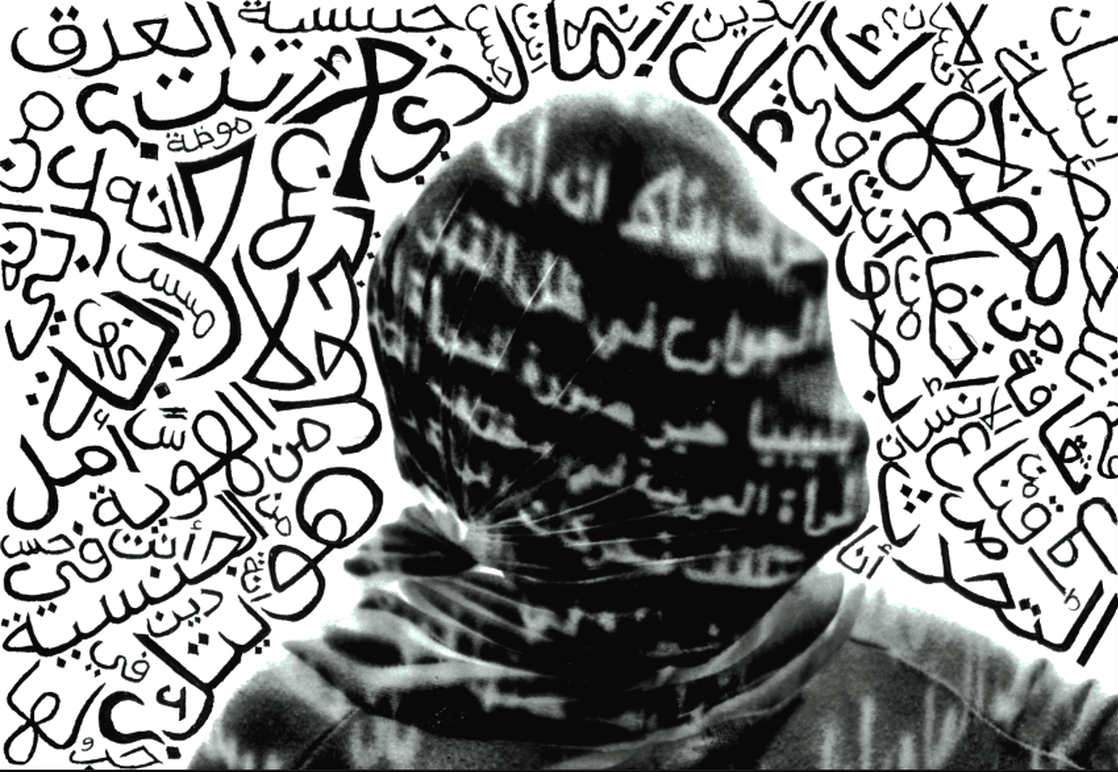
Using the technique that I discovered from Jo Dressler and the inspiration from Shirin Neshat. I found that Shirin Neshat's work was the most appropriate for using arabic text to scratch over a black transparency using a compass. The written text is from a piece of writing from the model that she personally wrote about herself and her identity and it consists of things that make her what she is today. She mentions personal things that mean a lot to her and things that she has been through. I think it was important for me to write something from the person themselves rather than any random text because it has a stronger meaning as it is something personal and sensitive to her so it makes sense. I have drawn other details on to the transparency such as the had eyes, nose, lips etc. to add life to the image and actually make it look like a human since it is already missing other important features such as colour. The black and white tone makes it seem as something very serious. I am quiet proud with the outcome and progression of the responses because it helped me intertwine more than one inspirational artists together. I have really liked the arabic text within my work and am looking forward to using it for future projects as i feel very confident when working with things that are related with the Arabian culture.

ANDREAS POUPOUTSIS
For this response I used a white piece of material to wrap the head very tightly and then project my Arabic writing about self-identity and how identity is portrayed within the Middle East over the head. The facial expression of the face can be seen through the material, although this was hard to achieve, I think I was able to do it by exaggerating the expression on my models face and not using a very thick piece of material. The face looks like it is screaming with the mouth wide open, screaming to be let out and have the freedom to reveal their identity which is very powerful. There is a dramatic difference between the original image and this final image because I have used Photoshop to edit it, on the original image the writing was not standing out and clear so I increased the contrast on it and added a rough effect to add an alarming touch to the reader. For the people that are not able to read he Arabic writing, they will still be able to tell the meaning behind the image through just analyzing. Simple touches such as blacking out the background and increasing the white have made the overall image look intense. I printed the image onto a transparency and scratched words relating to the image onto the picture, in different sizes and covered all of the back background, I liked the way the white looked against the black and the concept of adding more words to the image. It demonstrates more anger and force to the final appearance.
For this response I used a white piece of material to wrap the head very tightly and then project my Arabic writing about self-identity and how identity is portrayed within the Middle East over the head. The facial expression of the face can be seen through the material, although this was hard to achieve, I think I was able to do it by exaggerating the expression on my models face and not using a very thick piece of material. The face looks like it is screaming with the mouth wide open, screaming to be let out and have the freedom to reveal their identity which is very powerful. There is a dramatic difference between the original image and this final image because I have used Photoshop to edit it, on the original image the writing was not standing out and clear so I increased the contrast on it and added a rough effect to add an alarming touch to the reader. For the people that are not able to read he Arabic writing, they will still be able to tell the meaning behind the image through just analyzing. Simple touches such as blacking out the background and increasing the white have made the overall image look intense. I printed the image onto a transparency and scratched words relating to the image onto the picture, in different sizes and covered all of the back background, I liked the way the white looked against the black and the concept of adding more words to the image. It demonstrates more anger and force to the final appearance.
Moreover,I decided to take the second response and develop it further in the dark room and experiment with a different result. The above image was the outcome. I ended up with the colours contrasting, so the parts that were black such as the background turned white and the white writing turned black. For the first attempt I exposed the image for too long under the natural light, and the writing over the face didn’t come out well because it was already dark. So when I tried it again I left it for only 3 seconds and was pleased with the result when they were developed. I think the journey of this response was interesting and fun, I resulted with different outcomes that all worked really well.

MARIA FRODL
I incorporated my main strength within this theme, which is the Arabic text to represent a persons social and political belief. Within my personal study I experimented with text in so many ways especially Arabic writing because I found that is something that has been very effective within my work. Therefore instead of projecting words on to the face and body or writing on a printed piece of paper or even scratching it within a transparency. I decided to directly draw on the face using makeup and writing words that are relevant such as 'identity', 'freedom', 'expressing emotions', 'character, 'self-traits' etc. that are closely related to the them of identity and culture and that can express that the person is tryin to reveal their identity but there is something holding them back. The subject within the image that 'holds' the person back from revealing who they are freely, is the cling film used to the wrap the face in a very vicious and forceful manner creating a dramatic emphasis on the image. the colours that I used to write on the face were red and black which are dark and dramatic colours that represent something serious such as danger, and brings the audiences curiosity towards the image.
I incorporated my main strength within this theme, which is the Arabic text to represent a persons social and political belief. Within my personal study I experimented with text in so many ways especially Arabic writing because I found that is something that has been very effective within my work. Therefore instead of projecting words on to the face and body or writing on a printed piece of paper or even scratching it within a transparency. I decided to directly draw on the face using makeup and writing words that are relevant such as 'identity', 'freedom', 'expressing emotions', 'character, 'self-traits' etc. that are closely related to the them of identity and culture and that can express that the person is tryin to reveal their identity but there is something holding them back. The subject within the image that 'holds' the person back from revealing who they are freely, is the cling film used to the wrap the face in a very vicious and forceful manner creating a dramatic emphasis on the image. the colours that I used to write on the face were red and black which are dark and dramatic colours that represent something serious such as danger, and brings the audiences curiosity towards the image.

SHIRIN NESHAT
Merging two images of the same person, however one is covered using islamic clothing such as the hijab and the other half of the image has no covering. We are able to perceive the person from two different perspectives. Do they still portray the same identity? I chose for one of the images to be in black and white because it reinforces the idea of being covered and makes it bold to the audience. I wrote in arabic text themselves a thick black pen to make it bold and stand out against the white. the quote in Arabic speaks about how one can cover themselves and their beauty and identity will still prevail.
Merging two images of the same person, however one is covered using islamic clothing such as the hijab and the other half of the image has no covering. We are able to perceive the person from two different perspectives. Do they still portray the same identity? I chose for one of the images to be in black and white because it reinforces the idea of being covered and makes it bold to the audience. I wrote in arabic text themselves a thick black pen to make it bold and stand out against the white. the quote in Arabic speaks about how one can cover themselves and their beauty and identity will still prevail.


Here are two of my responses created using some of my best images from the photo-shoot in the Victoria & Albert museum, I used Photoshop for this final outcome. I ensured my model was from an Arabic heritage to be able to represent Middle Eastern women’s identity, which this strengthened the image to look more accurate, and for her to fit in the scene created. To reach this outcome I have used the same Islamic pattern used on the Harem onto the Islamic dressing (abaya) as if the ceramic wall is projected onto her patterned abaya. A sense of both culture and identity is reflected within my work, it a way in which culture and you identity can be expressed and may have multiple meanings. For example Essaydi uses this in which to represent the Arabian women and how they are not oppressed when coming to reveling who they are confidently by wearing something that simply represents something to do with them such as ethnicity or faith.

I think that overlaying the layer of the harem onto the abaya via Photoshop has worked effectively because of the opacity that has been decreased so that you are still able to tell that it is an Islamic dressing she is wearing. Another way I could achieve this is through printing the pattern out onto transparency paper and over laying it only on the sections I want such as the abaya. Another aspect that has made my work successful and effective was the repeated pattern of the harem that I prudently duplicated to extend the shape of harem and add the vivid blue and for it to show that the location wasn’t a museum but a location in Morocco where the Harems are frequently found.
